Thank you! Someone from our sales team will be in touch to schedule a demo shortly.

In the final installment of this three part series, we gear up to fix what's broken.

No, literally, it's out of order.
Take a moment to consider the absurdity of “confirming your purchase” when shopping online. With the click of a button, you watch money leave your account -- and this is a week before the package arrives at your doorstep. And if you want to return that item? More waiting. This time, the merchant will typically expect to see a product back from you before you see money back in your account. How does that make any sense? Not to mention this is a rather lopsided trust dynamic!
Personally, we’d prefer to “confirm & pay” once we’ve confirmed for ourselves that we want a product.
Last week, we said it was time to rebuild the foundation of ecommerce transactions. So here goes…
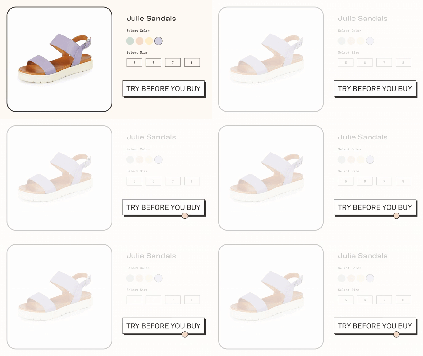
What if we suggested this design for all your PDPs:

That’s right. No “buy now,” no “pay now,” no “confirm my purchase.” Instead of asking your shoppers to pay first and try second, you empower shoppers to try before they buy. In fact, you insist.
Why a new CTA?
The industry standard is essentially a “buy-now” button.
We click buy-now when shopping online because we have no other option. This lack of choice commits a grave injustice against the shopper. The shopper is robbed of the ability to try a new thing.
When you try something, you make a decision about whether to make that item a part of your life, an expression or extension of yourself in the world. It is through the experience of trying that you fall in love with a product. And it is products that we love and want in our lives that we spend money on.
The buy-now button has taught us that only a small fraction of shoppers are willing to forgo the natural order of trying before buying, and instead pay for the chance to experience. The vast majority -- roughly 97% -- instead miss the chance. And as a merchant, you miss the chance to add a lifetime customer to your community.
It’s time to get a new CTA, one that puts the process of online shopping back in order; the order that is natural to shoppers, the order that exists in each and every brick and mortar store, and the order that benefits shoppers and merchants.
“Easier said than done.”
We know what you’re thinking:
This is far more complex than a simple CTA change.
There’s a reason trying before buying didn’t start as the norm in ecommerce.
If a brand wanted to offer try-before-you-buy ...
...It meant manually handling payment information
...It meant delayed cash collection
...It meant exposure to fraud
...It meant custom fulfillment processes
...It meant complex SKU reconciliation
...It meant a separate returns flow
That’s a tall order for any brand.
But what if it was that simple? As simple as embedding these
complex business processes into a single try-now CTA?
What if a trial experience could be totally automated,
and facilitated by your existing checkout -- with no extra steps?
What if you could offer try-before-you-buy to shoppers while making
zero changes to your fulfillment process, your ERP, your OMS?
What if items that shoppers didn’t keep flowed back through your
existing returns process, efficiently handled by your RMS?
What if, even though the shopper only pays for kept items at
the end of the trial, you got paid in full at the time of purchase?
What if you could guarantee that your risk for fraud
would not increase with a trial program?
If all of this was true, what would stop you from putting your product in shoppers
hands first, and letting them decide if they were going to love it and keep it?
It’s not “if”, and its not “when.” It’s now.
At TryNow we make putting your ecommerce store “back in order” as simple as a new CTA.

If you have a great product, let people try it.